
0
************
Table of Content
This page contains our table of contents, showing post permalinks, the date and labels (category names.) There is a short preview of each post when you hover the cursor over the title. Titles are in alphabetical order, but you can click on the date column header to sort in ascending or descending order. Click on a specific label (not the column header) to display only the posts tagged with that label. To go back to the full list, just click Post Title. When this post migrates off the home page visitors can use the menu or sidebar link to see the contents.
************
************
0
It's a good idea to block out the layout of your design before you start, either on paper or in Photoshop, to streamline your workflow and organize your ideas.
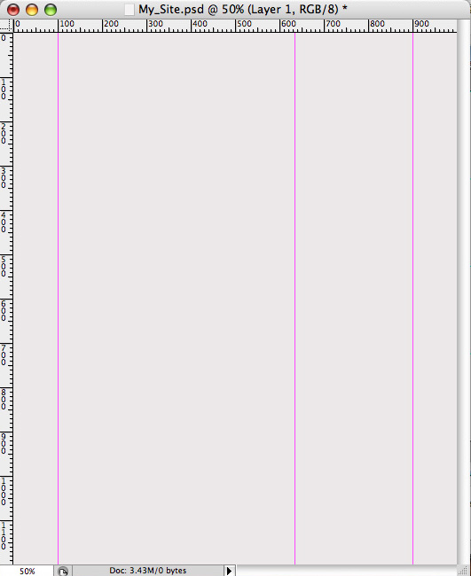
Now, I'm not going to go into the debate about screen resolutions and optimal website width here. All you need to know is that the content of our page is going to be 800px wide, and that that's okay. So, on our 1000px wide document, we're going to drag in guides at the 100 and 900px marks to set the width. Our design has a sidebar, and I've decided to make it one third the width of the page. Two thirds of 800 is about 530, so let's put in one more guide at 630px. We'll also set a nice background color of #ebe8e8.
Now lightly click the tip of the brush right below the bar, around the centre of the document. Keep it subtle, and try not to let the lighter color reach the edges of the page (this will be clear later). And set the blending mode to screen.
In the layer styles panel, add a gradient from #e2e3e4 to #bebdbd at 90degrees.
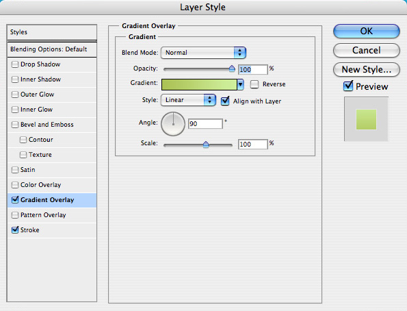
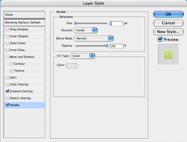
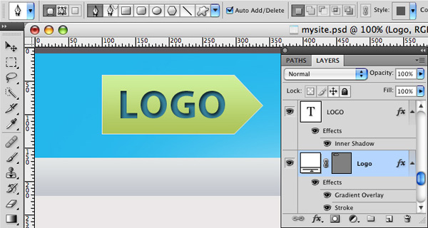
Next, add some layer styles: a gradient overlay and a 1px stroke: Gradient from #aec457 to # cdf399
Make the text boxes about The width of the first 2 thirds of the page. Text styles:
h2 Header:
The dates under "latest updates" are going to be wrapped in a small tag, the font is the same as the paragraph, but 12pt. I copied the news item twice, cause I'm lazy.
Fill up the sidebar with some more dummy content, you can get the free icons I used here. The fonts are:
h3 Headers:
And that's it for the page design, it's nothing special, but its simplicity will make it easier for you to follow the rest of the process.
Now that we have this little stripe, we can repeat it along the x-axis. The highlighted area, however, is non-repeating, so we have to cut out the whole thing. Slice the section of the header between the two guides that denote our 800px width.
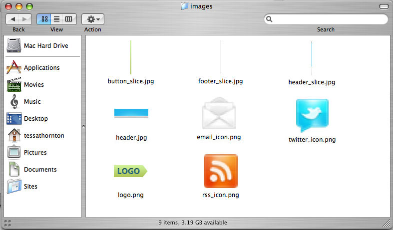
Because the icons and the logo are irregularly shaped, we're going to save them as transparent .png files, so we're going to come back and grab them separately.
Okay, so to slice the button, we can use the same technique as the header and footer, but this time we only need the one thin slice. When you make the slice, be sure to not include the 1px stroke, (we're going to add that in later) you might need to zoom in really close for this.
Go to File/Save for web and devices... In the popup window, hold down shift and click to select each of the slices (again, you might want to zoom in) Check that the "preset" drop-down menu is set to JPEG-High, uncheck the "convert to srgb" and click "save"
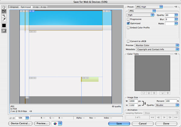
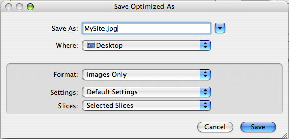
In the next window that pops up, pick a name and location for your images, I'm just going to save to the desktop for now.
Make sure it's set to "images only", "default settings", and "selected slices only."
Next, check out the location you saved your files to. Instead of seeing the individual images, you'll just find a folder labeled "images" where all your pictures are located. The computer will give each image a number, which isn't very useful. Check that you have the right images, then name them appropriately.
Now, back to those pesky icons and the logo. Be sure to hide all the background layers, then take out the slice tool again and cut out nice little boxes around each icon and the logo.
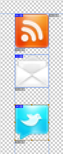
Now we go through the same process of exporting for the web as we did with the jpegs, only this time be sure to select PNG-24 from the "preset" dropdown menu, and that the "transparency" box is checkmarked. Rename these files too, and your images folder should look something like this:
Alright, that's it, we're done cutting up our psd, and we have all the images we need. Don't close Photoshop just yet, though, we'll still need to pick out colors, fonts, dimensions, etc.
In this tutorial, we're going to use Komodo edit, but the principles are the same in every editor.
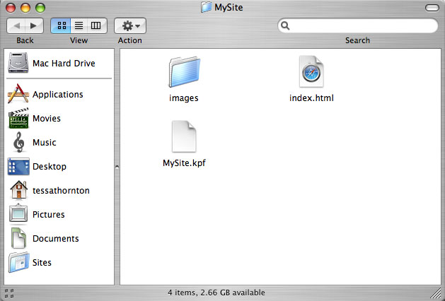
If you're using another editor, the process should be similar, but the essentials are the same: you need to create an index.html file, and it needs to be in the "MySite" folder along with the images folder.
between the html tags, we need a "head" section, which contains all sorts of important information about the site which isn't displayed within the body of the site. For us, at this point all it's going to contain is the title of the page, like this:
below the head, logically, we add the body, also contained within the tags. Okay, so far we have:
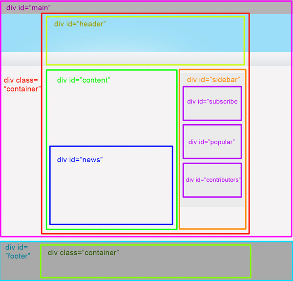
This is a basic page setup, you might want to save this clip somewhere for future use. So remember when we said we'd have header, content, sidebar, and footer sections? Good, now each of these is going to be within its own
To handle this, we need a big div holding our expanding elements, and a div to contain the main content. We should also notice that the footer text is centered too, so we need to repeat the same process for the footer. To do this, we need to wrap some divs around the ones we already have. We have two basic sections, the main section, and the footer section. Each is going to be contained within one big, unruly div with an unspecified width, and the content of each will be wrapped in individual divs that specify width and centering.
We want to use the same rules for the main and footer content, so instead of (or in addition to) specific id's, they will have specified classes, which means you can create a set of rules to define all div's with the same class.
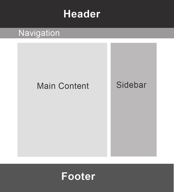
So the main content is going to be wrapped inside a div with the id "main" and our footer will be wrapped in a div with the id "footer." If it helps to visualize the structure, here's a diagram:
And the markup looks like this:
Now we wrap each section in a containing div, with the class of "container."
I know all these wrapping divs seem redundant, but they will become relevant when we start styling the page.
Because it's the most important heading of the page, the Logo is going inside an
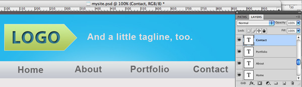
tag. For the navigation, standard practice is to place menu items within an unordered list, with each list item containing an anchor tag. So we have:
, , and , respectively. Now it's just a matter of pasting in your content, which isn't much fun, but it is pretty easy.
header, and an unordered list, and each list item will again contain an anchor tag. So go ahead and copy and paste your text in, and it should look something like this:
And that's about it for the markup, let's take a look:
looks pretty good, no? Well, no, not yet. But it does contain all the information we need, and is ready for styling.
Now our html file can access our css file, so whatever changes we make to the css will affect the html file.
First, we're going to pick a font for all text within the body of the page, which will be displayed unless otherwise specified:
Next, let's define the width and margins of our "container" class divs.
the margin: 0 auto property is shorthand meaning that there is no margin at the top, and that it will be automatically centered horizontally. Let's take a look.
Much better. The next step is going to make things look much worse, but stick with me.
To get rid of all these messy margins, we're going to use a very simple css reset, which is just a rule that gets rid of the default padding and margins on the elements we're using. Put this at the top of your css file:
now let's look:
We'll star with the repeating slice we took of the header. The repeating image is going to be within the "main" div, which has an undefined width. We need to let the browser know where the image is, and what to do with it (repeat, no-repeat) to set a background image, we use the property "background" and specify the location of the image or 'url': in our case, the image is in our images folder, so we specify the location like this:
then specify that we want it to repeat along the x-axis:
Check it out:
awesome, right? Try stretching out your browser, it just goes on and on and on... But we're still missing the highlight on the blue bar, and since we cut out an 800px part of our header, we can put it inside our "container" div. Problem is, we have two of those (one for the main div, one for the footer) so we need to specify that we want the div with the class "container" that lies within the div with the id "main" set the image the same way as before, but this time we need to specify "no-repeat":
Take a look:
great! the highlight is sitting just where we want it, and blending in to the repeating sides.
header, your site could be called kalamazoo, but it wouldn't turn up in a search for that exact word. There are various other techniques which have their advantages over this one, (see here, especially technique #8) but this is the simplest and the most appropriate technique for this situation. So, to fix this problem, we use a devious little technique called "image replacement" to use the image that we want, while keeping the
header in our markup. First, let's add the image as a background to the #logo div.
text in our way, but we can fix it! All we're going to do is set the text-indent value to something ridiculous, like -9999px, way off the page, so no one will ever see it, except the search engine robots.
text used to be. But it still looks pretty bad, all cramped up at the top there. When we want to move an item from its original position on the page, we can use both the padding and the margin properties. We're going to try both to see the difference First, let's try adding a margin to the top of the h1 tag. We can find out how big to make it with the ruler tool in Photoshop.
header move down 40px, but this is not what we were going for. So, to move the background image of the logo, we need to move the div above it, because the whole logo div is the "content" of the header div. let's try it out:
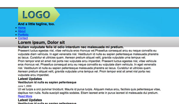
Okay, so what's a float? Well, that's complicated. Basically, when you tell an element to 'float', it sticks it to the side of a page or element, and also takes it out of the normal "flow" of the page. Confused? Let me demonstrate.
Well, as you can see, we managed to get our tagline out to the side, but it took the navigation menu with it. I think of it this way: a normal element (for example, a div, or an h1 header, or an image), even if it's really small, invisibly occupies all the space to the side of it, like one big long horizontal bar.
This is why all the other elements stay beneath it, instead of cozying up beside. When you float an element, You take away all the extra space to the side, and restrict it to only the space it directly takes up, allowing other elements to wrap around it. Now that you know how floats work, how can we fix our present situation? First, we have to isolate the tagline into a float of its own, so it too lies outside the normal "flow" of the page:
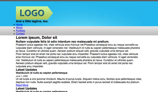
Take a peek in the browser, and look at that, we made it worse. Now the menu items are wrapping around our tagline! What we need here is to restore the normal flow of the document after the floated elements. There are a couple ways to do this, but we're using the most straight-forward method. Go back to your index.html file, and add in a new div beneath our floated divs. Instead of adding a class or id to this div, we're going to give it a style (yes it's an inline style, but only a teeny little one) clear: both.
Resave your html file and check in your browser: you should see the tagline out beside the logo, with the menu below. Now all we have to do is get that tagline into shape, and put it where it belongs. Let's start by copying the font styles over from Photoshop:
and then add a bit of padding at the top and left:
take a look: now we're getting somewhere!
Great, now, we need to find a way to get all our links in a row. How? More Floats! We're going to set the list-items to float left, so that each item sticks to the one beside it.
If you look in your browser, you'll notice the same problem we had before with floated items: other elements are wrapping around it. Just like before, we can insert our clearing div right after the unordered list.
All our list items should be in a line now, we just have to space them out and move the menu down a bit. So first measure the distance from the bottom of our logo to the top of the menu text, and we get about 55px. the first item is about 30px left of our guide, so let's set the list item padding to 30px left.
We still need to put more space between each item, if we measure the space in our psd, it's about 105px, but since we already have 30px padding between each, we only need to add 75px padding to the right of each item.
And finally, admire our work:
Perfect! Our menu is just like the psd. On to the content!
We get something like this:
At this point you may notice that we haven't set a background color for the content area yet. This is because... I forgot. So let's just do that now, shall we?
Alright, now we're ready to add some padding to space everything out. first, the distance from the bottom of the nav menu to the top of the h2 heading is about 25px:
Next, the distance from the bottom of the h2 heading to the top of the h3 heading is also around 25px, so repeat basically the same code:
Now, the distance from the bottom of the h3 heading to the top of the first paragraph is about 45px, but if we set the padding-top to 40px, we will also end up with 40px of padding between the two paragraphs. Since the paragraphs are only about 20px apart, we need to split the padding into top and bottom: add 20px of padding to the bottom of the h3 heading, and 20px of padding to the top of the paragraph.
Check out the results:
Which looks like this:
There, now all we need to do is get the sidebar out to the side, and we're done the main content.
Now, to get the sidebar out there, we will once again be using floats, setting both the content area and sidebar to float left.
If you take a look in your browser, you will notice that our footer text has wrapped around the sidebar. We know how to deal with this problem by now: we just need to add our little clearing div to the markup:
Alright, next step is to just copy over the font styles from our psd for the sidebar:
Remember that to style the font of the links in an unordered list, we need to refer to the anchor tag, rather than the list item itself. Now, if we look over at our psd again, we'll notice that the text for the list items in the "subscribe" widget is slightly larger than in the rest of the sidebar. To fix this, we need to target the specific unordered list, so we need to add an id value to the subscribe ul in our markup:
Then we can refer to it in our css:
Now we need to style our sidebar: add padding, margins, backgrounds and borders. First let's get rid of the bullets:
OK so it's still way in the wrong spot, so let's fix that by adding margins to the top and left. When measuring in your psd, measure to where the border of the sidebar begins.
Now for the background: underneath the margin-top property, add the background and border properties:
Next we'll add 15 px of padding on all sides:
And then add the padding to our text styles to space out our menu:
Our sidebar already looks almost perfect, we just need to add in the icons in the subscribe section, and style that "join us" anchor tag.
Okay, so let's get those icons working. Adding images to an unordered list can seem confusing, but if you take things step by step, it makes perfect sense. But it is a bit tedious. To start, we're going to have to make some room for the icons. We're going to set them as background images, so if we use the padding property to move our list items over a bit, the images won't be affected. The icons are about 26px wide, so we'll add some padding to the left of the list items:
Now we need a way to target each separate list item, so we'll add some id's in the markup:
Now we add background images to each list item:
At this point it occurred to me that perhaps 18px was a bit too big for the links here, so I reduced it to a less dramatic 16px, which allowed me to add in a teeny bit more padding on the left without stretching the sidebar out.
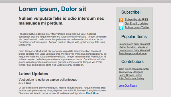
Our spartan little sidebar is almost complete! Now to style our button:
We need to target the button, so let's add a class to the markup: (im using a class instead of an id this time, which is common practice, as we could hypothetically add more buttons later)
So let's just fix up the text style and add in our repeating background slice:
as you can see, our background image is there, but it only appears directly behind the text, we need to give it space to spread out. First, let's give it a margin to get it into the centre of the sidebar:
and some padding on each side so our button spreads out:
This is a short-hand way to write the padding properties, and is entirely acceptable, and even encouraged, since it saves space. In this case, it specifies 13px of padding on the top AND bottom, and 23px of padding on the left and right.
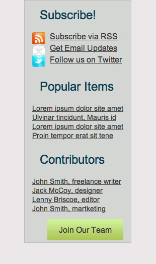
the button looks great, but oops! it moved to the right 23px, so let's reduce our margin a bit to compensate:
Now let's just give it some space underneath by adding padding to the entire sidebar div:
here's that shorthand property again: it goes in this order: top, left, bottom, right. So here it says 15px on all sides except the bottom, which should be 30px.
finally, we just need to add that 1px border to the button class:
And there we have it, one sidebar!
It's a start, but it's really tiny. let's add some padding, and make the text white:
and the whole thing:
So next... wait? what? we're done? We're done!
Now just some housekeeping to worry about: Validation.
RED (Red is bad!)
Don't worry, it's not so bad; let's review what went wrong: looks like I only have one error:
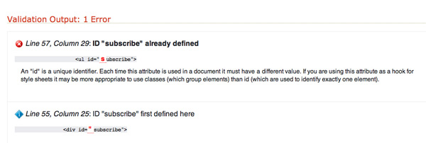
They caught me using the same id tag twice, which could cause serious confusion. Since we have lots of styles defined for the ul with the id "subscribe", we're just going to change the name of the div instead: let's call it "feeds" Now we need to check that we haven't defined any styles for #subscribe, and we haven't! To be safe, let's reload our page to make sure there were no unintentional changes. Looks good! Now let's run the validation again:
Success! Our page is now valid XHTML. You can even download an icon if you want to brag.
Note: I was pleasantly surprised to find only one error, if you're not so lucky, read the suggested info at w3 shcools, or check out this article by Glen Stansberry.
It seems we're done! Ah, but if only it were that easy. We still have to validate our CSS!
We're Valid!
However, we did get a couple warnings. To stay within the good graces of the church, we should certainly pay attention to them:
It's just a few little problems: we should have declared widths for all our floated items. Again, these suggestions are optional, but it's best to listen to constructive criticisms. Cleaning Up: our tagline, menu unordered list items, and sidebar all need to have widths declared. We also want to do this without changing the appearance of the page. First up, the tagline. We can just make a rough guess on this one, it's about 400px wide.
Excellent, if we validate again, no errors, not even a warning! Our webpage, as far as w3c standards are concerned, is perfect.
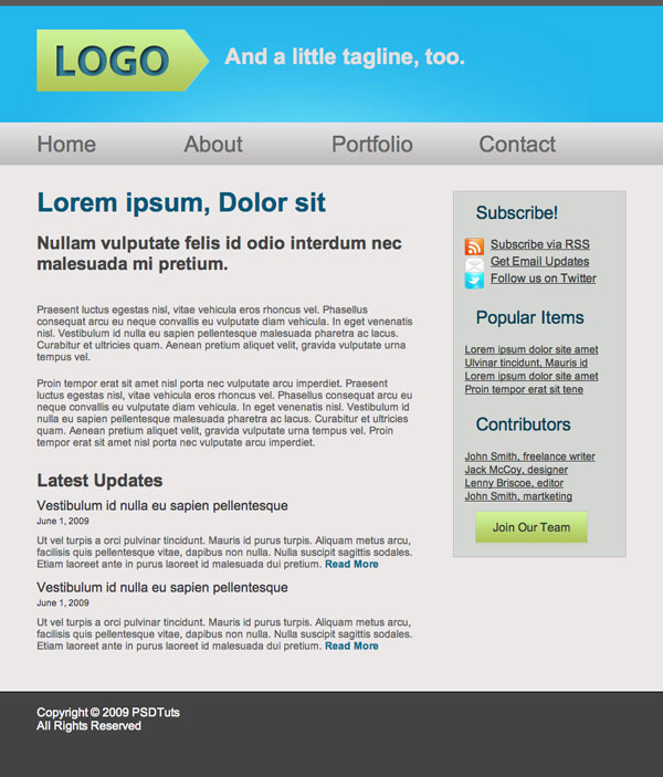
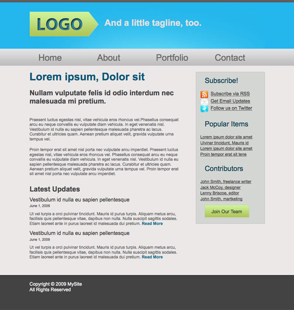
Design and Code Your First Website in Easy to Understand Steps
We're going to design and code this very simple website. Spectacular design, it's not, but it'll be very effective for teaching basic coding techniques.
Step 2 - Getting Ready
What you need
This tutorial was written assuming that you've never coded a website before, or have only done it a few times. Nevertheless, to complete this tutorial, you will need the following:- Photoshop or a similar image editor
- A code editor (more on that later)
- Basic understanding of how html works, basic syntax and tags. To get up to speed, check out the official resource at w3 Schools, where you can learn all the basics needed for this tutorial.
- Ditto for css, you should understand how selectors work and be familiar with basic properties. Again, the best resource here is w3 Schools
- A browser, obviously. I'm using Firefox, and if you want your site to look just like my screenshots in each step, you should too
Layout
We're making a very simple website here, with four basic elements: header, content, sidebar and footer, the layout is going to look something like this:Step 3 - Getting Started
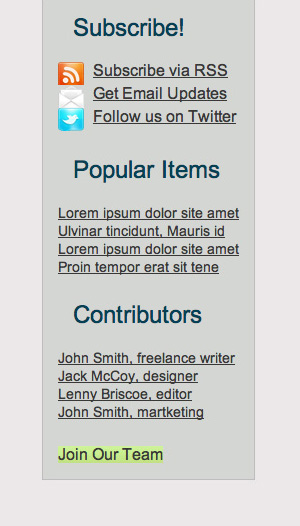
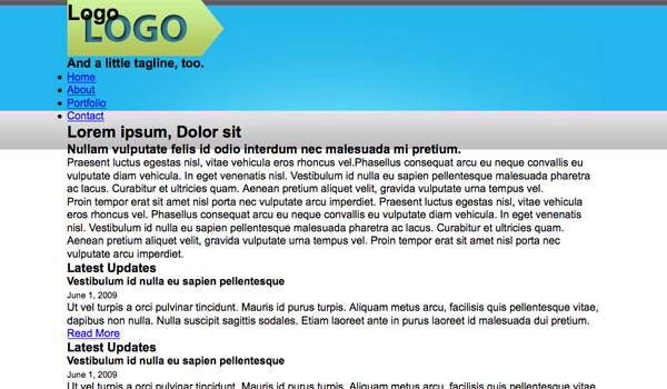
Open up a shiny, new Photoshop document, say, 1000px by 1200px. We can always crop it later. I'm making it pretty narrow because I'm working on a laptop here, but feel free to go wider if you like more space to work.Now, I'm not going to go into the debate about screen resolutions and optimal website width here. All you need to know is that the content of our page is going to be 800px wide, and that that's okay. So, on our 1000px wide document, we're going to drag in guides at the 100 and 900px marks to set the width. Our design has a sidebar, and I've decided to make it one third the width of the page. Two thirds of 800 is about 530, so let's put in one more guide at 630px. We'll also set a nice background color of #ebe8e8.
Step 4 - Header
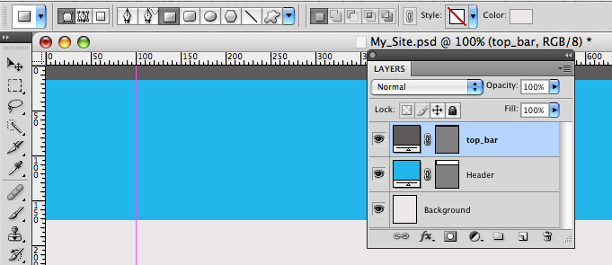
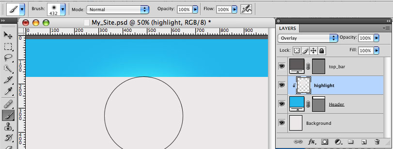
Grab the rectangle tool and draw a big, blue box at the top of the document, mine is about 170px high and the color is #23b6eb. Next draw a skinny, dark grey bar at the very top of the page, I used #5d5a5aStep 5 - Highlight
Now we're going to add a bit of a lighting effect on the blue header area. Create a clipping mask above the blue layer, then Grab a big, soft brush (400px wide) and pick a color a bit lighter than the blue background.Now lightly click the tip of the brush right below the bar, around the centre of the document. Keep it subtle, and try not to let the lighter color reach the edges of the page (this will be clear later). And set the blending mode to screen.
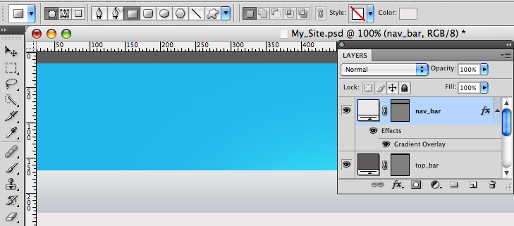
Step 6 - Navigation Bar
Now we're going to add another bar to the bottom of the blue one, we can make it grey, but we're going to add a gradient overlay so it doesn't really matter.In the layer styles panel, add a gradient from #e2e3e4 to #bebdbd at 90degrees.
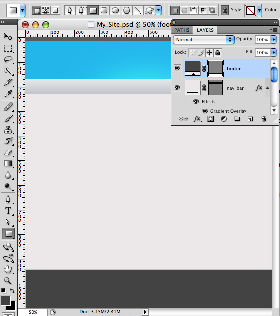
Step 7 - Footer
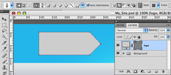
Next, let's draw a grey box at the bottom of the page, I picked a color a bit darker than the grey from the bar at the top.Step 8 - Logo
Background
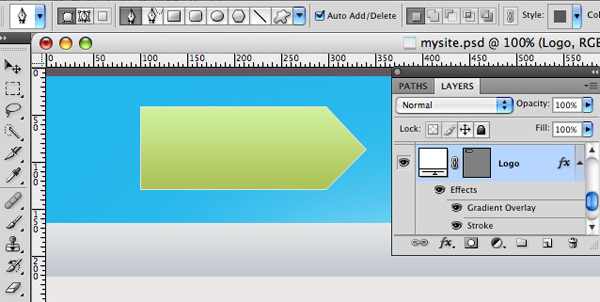
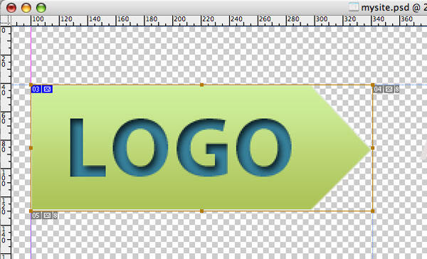
For the logo, we're going to draw a rectangle and add another anchor point at the end, then drag it out to the side. To get rid of the rounding, option-click on the point.Text
Now for the text: big and bold.- Font: Myriad Pro
- Style: Bold
- Size: 60px
- Color: #36809a
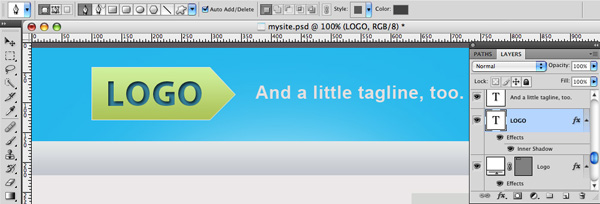
Step 9 - Tagline
Next I just added in a short tagline:- Font: Arial
- Style: Bold
- Size: 30pt
- Color: #e4dfdf
Step 10 - Navigation
Write in the navigation links nice and big, spread them out and space them about evenly.- Font: Arial
- Style: Bold
- Size: 30pt
- Color: #676666
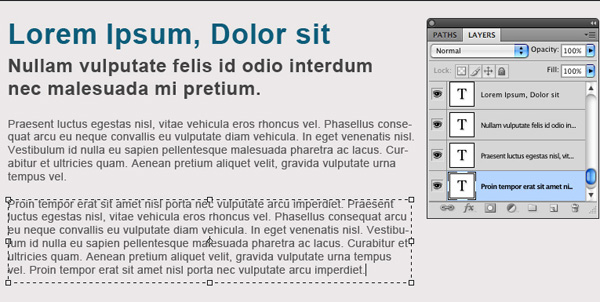
Step 11 - Main Content
Time to paste in some dummy content. I used one bit header, which will be h2 and the smaller one will be h3 link to html ipsum.Make the text boxes about The width of the first 2 thirds of the page. Text styles:
h2 Header:
- Font: Arial
- Style: Bold
- Size: 36pt
- Color: #0e5d7a
- Font: Arial
- Style: Bold
- Size: 24pt
- Color: #444444
- Font: Arial
- Style: Normal
- Size: 14pt
- Color: #595858
Step 12 - Sidebar
Links
Next draw a skinny rectangle over our sidebar region, color #d4d6d3, with a 1 px stroke of #bebdbdFill up the sidebar with some more dummy content, you can get the free icons I used here. The fonts are:
h3 Headers:
- Font: Arial
- Style: Normal
- Size: 24pt
- Color: #044055
- Font: Arial
- Style: Normal
- Size: 18/14pt
- Color: #373737
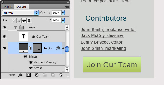
Button
Next we're going to add a "join our team" button beneath the contributors links. The button is just a rectangle with the same gradient as the logo, and a 1px stroke color c7c7c7. The text is:- Font: Arial
- Style: Normal
- Size: 24pt
- Color: #434343
Step 13 - Footer
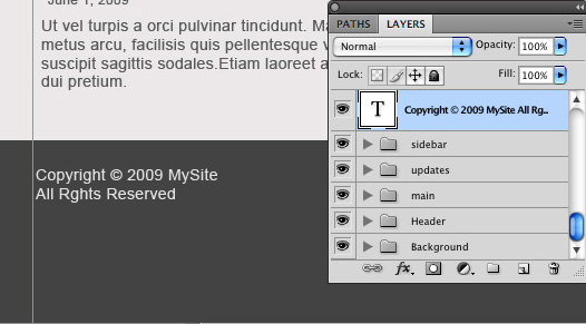
To finish off the mockup, just add a bit of dummy copyright text, or whatever you want, to the footer. The font is:- Font: Arial
- Style: Normal
- Size: 14pt
- Color: #e0e2e2
Part Two - Slicing the PSD
Now that we have our lovely completed psd, it's time to chop it up into pieces we can use. The idea here is to use as few images as possible, and to make them as small as possible. Okay, so let's start with the header. We want it to stretch out across the whole screen, no matter how wide it is. To do that, we're going to grab a tiny little sliver of the header, and have it repeat across the screen again and again, no matter how wide.Step 14 - The Slice Tool
Now you probably haven't had to use the slice tool before, but it's really very simple. It just lets you slice your file into teeny tiny pieces which can be exported for the web.Header
So, let's go ahead and grab a little slice of our header. Click and drag to create the slice, just like the rectangular marquee tool. Be careful to take the slice from the side of the image, so you don't get any of the highlight.Footer
We use the exact same process for slicing the footer, grab a skinny piece of the footer.Everything Else
We just need a couple more images: the "subscribe" icons and the "join our team" button.Because the icons and the logo are irregularly shaped, we're going to save them as transparent .png files, so we're going to come back and grab them separately.
Okay, so to slice the button, we can use the same technique as the header and footer, but this time we only need the one thin slice. When you make the slice, be sure to not include the 1px stroke, (we're going to add that in later) you might need to zoom in really close for this.
Step 15 - Export for the Web
Now that we have our images all sliced up, let's save them as optimized jpegs and put them someplace useful.Go to File/Save for web and devices... In the popup window, hold down shift and click to select each of the slices (again, you might want to zoom in) Check that the "preset" drop-down menu is set to JPEG-High, uncheck the "convert to srgb" and click "save"
Make sure it's set to "images only", "default settings", and "selected slices only."
Now, back to those pesky icons and the logo. Be sure to hide all the background layers, then take out the slice tool again and cut out nice little boxes around each icon and the logo.
Part 3 - HTML
Step 16 - Getting Started
Alright, time to dive into some html. The first thing you're going to need is a code editor of some kind. This is often an area of personal preference, but I recommend starting off with a free one. For mac and PC, I highly recommend Komodo edit as a first code editor. It has a lot of features that are ideal for beginners and advanced users. One of the best features is the syntax-checker, which is like the spell-check in word processors, which will identify and explain little mistakes. For PC, there are a lot more options, none of which I'm very familiar with, but check out Andrew Burgess' article 22 Neat Code Editors for WindowsIn this tutorial, we're going to use Komodo edit, but the principles are the same in every editor.
Step 17 - Setting up our Folders
First things first, we need to set up a place to hold all the files related to our site. Create a folder for your website, mine is called "MySite", inside this folder, create another folder containing the images we just sliced. Name this folder "images". Now we open up our code editor, this part will be a bit different depending on what software you're using: If you're following along in Komodo, select "create new project" and save/move the .kpf file to the "MySite" folder. When you open up the file, the file browser at the side of Komodo should display the contents of the folder. Next right-click on the project file, and scroll to "add" and select "new file". In the window that pops up, select "html(xhtml)" and name the file "index.html".Step 18 - Setting up our index.html File
The first thing we need to do is declare the doc type, character encoding, and create the tags. Many editors will do this for you, but if not, it should look something like this:- xml version="1.0" encoding="UTF-8"?>
- >
- <html xmlns="http://www.w3.org/1999/xhtml" xml:lang="en" lang="en">
- html>
- <head>
- <title>MySitetitle>
- head>
- xml version="1.0" encoding="UTF-8"?>
- >
- <html xmlns="http://www.w3.org/1999/xhtml" xml:lang="en" lang="en">
- <head>
- <title>MySitetitle>
- head>
- <body>
- body>
- html>
, and will be given an appropriate id.
NOTE: it's a good idea, especially when you first start, to add comments at every
so you can keep track of the hierarchy of divs. Now let's take another look at our psd - remember how we want the footer and header slices to repeat indefinitely out to the sides? We're going to need a way to let these elements stretch out, but at the same time, we need the main content ("content" "sidebar") to be contained within a specified width at the centre of the screen. - <body>
- <div id="header">
- div>
- <div id="content">
- div>
- <div id="sidebar">
- div>
- <div id="footer">
- div>
- body>
To handle this, we need a big div holding our expanding elements, and a div to contain the main content. We should also notice that the footer text is centered too, so we need to repeat the same process for the footer. To do this, we need to wrap some divs around the ones we already have. We have two basic sections, the main section, and the footer section. Each is going to be contained within one big, unruly div with an unspecified width, and the content of each will be wrapped in individual divs that specify width and centering.
We want to use the same rules for the main and footer content, so instead of (or in addition to) specific id's, they will have specified classes, which means you can create a set of rules to define all div's with the same class.
So the main content is going to be wrapped inside a div with the id "main" and our footer will be wrapped in a div with the id "footer." If it helps to visualize the structure, here's a diagram:
- <body>
- <div id="main">
- <div id="header">
- div>
- <div id="content">
- div>
- <div id="sidebar">
- div>
- div>
- <div id="footer">
- div>
- body>
- <div id="main">
- <div class="container">
- <div id="header">
- div>
- <div id="content">
- div>
- <div id="sidebar">
- div>
- div>
- div>
- <div id="footer">
- <div class="container">
- div>
- div>
Step 19 - Adding Content
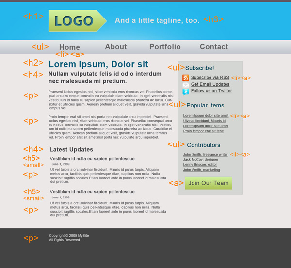
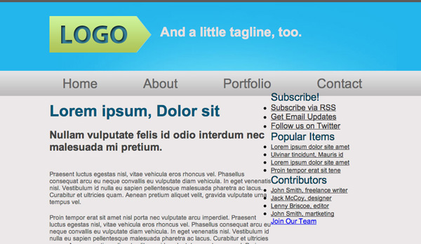
Now that the structure of our page is set, we can start adding content, from top to bottom. Here's an outline of the html elements that will make up our page:Header
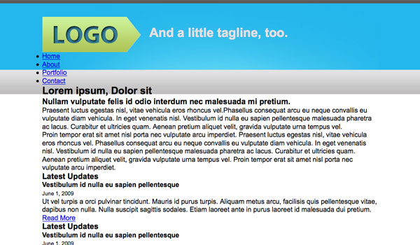
At the very top we have our header, and within the header we have 3 main elements: a logo, a tagline, and a navigation menu. So let's create a div for our header, and to keep things clean, we'll put the logo and tagline in their own divs.- <div id="header">
- <div id="logo">
- div>
- <div id="tagline">
- div>
- div>
tag. We have more options for the tagline, depending on how relevant it is to your site. In this case, I'm using an
tag. For the navigation, standard practice is to place menu items within an unordered list, with each list item containing an anchor tag. So we have:
- <div id="header">
- <div id="logo">
- <h1>Logoh1>
- div>
- <div id="tagline">
- <h3>And a little tagline, too.h3>
- div>
- <ul id="menu">
- <li><a href="#">Homea>li>
- <li><a href="#">Abouta>li>
- <li><a href="#">Portfolioa>li>
- <li><a href="#">Contacta>li>
- ul>
- div>
NOTE: the "href" value in the anchor tags would normally specify where the link goes, but in this case, the pound symbol just means "link to top of page."
- <div id="header">
- <div id="logo">
- <h1>Logoh1>
- div>
- <div id="tagline">
- <h3>And a little tagline, too.h3>
- div>
- <ul id="menu">
- <li><a href="#">Homea>li>
- <li><a href="#">Abouta>li>
- <li><a href="#">Portfolioa>li>
- <li><a href="#">Contacta>li>
- ul>
- div>
Main content
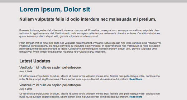
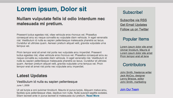
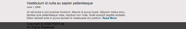
Looking at our main content area, we have 4 different styles of type: a big heading at the top, a smaller one, and an even smaller one heading for the news item titles, plus some paragraphs, and the small little dates on news items. We're going to call these,
,
, , and , respectively. Now it's just a matter of pasting in your content, which isn't much fun, but it is pretty easy.
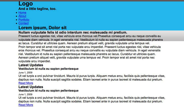
- <div id="content">
- <h2>Lorem ipsum, Dolor sith2>
- <h3>Nullam vulputate felis id odio interdum nec malesuada mi pretium. h3>
- <p>Praesent luctus egestas nisl, vitae vehicula eros rhoncus vel.
- Phasellus consequat arcu eu neque convallis eu vulputate diam vehicula. In eget venenatis nisl.
- Vestibulum id nulla eu sapien pellentesque malesuada pharetra ac lacus.
- Curabitur et ultricies quam. Aenean pretium aliquet velit, gravida vulputate urna tempus vel. p>
- <p>Proin tempor erat sit amet nisl porta nec vulputate arcu imperdiet. Praesent luctus egestas nisl, vitae vehicula eros rhoncus vel.
- Phasellus consequat arcu eu neque convallis eu vulputate diam vehicula. In eget venenatis nisl.
- Vestibulum id nulla eu sapien pellentesque malesuada pharetra ac lacus. Curabitur et ultricies quam. Aenean pretium aliquet velit,
- gravida vulputate urna tempus vel. Proin tempor erat sit amet nisl porta nec vulputate arcu imperdiet. p>
- <div id="news">
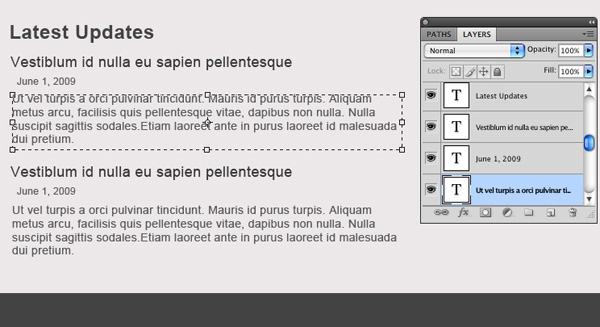
- <h3>Latest Updatesh3>
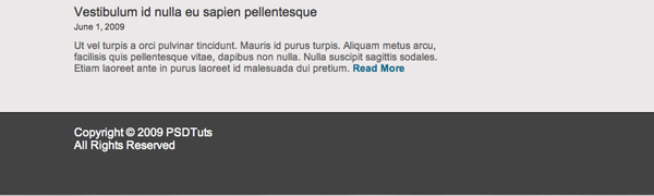
- <h4>Vestibulum id nulla eu sapien pellentesqueh4>
- <small>June 1, 2009small>
- <p>Ut vel turpis a orci pulvinar tincidunt. Mauris id purus turpis. Aliquam metus arcu,
- facilisis quis pellentesque vitae, dapibus non nulla. Nulla suscipit sagittis sodales.
- Etiam laoreet ante in purus laoreet id malesuada dui pretium.<a href="#"> Read Morea>p>
- div>
- div>
I've added anchor tags with the value "Read More" at the end of each news item.
- <div id="content">
- <h2>Lorem ipsum, Dolor sith2>
- <h3>Nullam vulputate felis id odio interdum nec malesuada mi pretium. h3>
- <p>Praesent luctus egestas nisl, vitae vehicula eros rhoncus vel.
- Phasellus consequat arcu eu neque convallis eu vulputate diam vehicula. In eget venenatis nisl.
- Vestibulum id nulla eu sapien pellentesque malesuada pharetra ac lacus.
- Curabitur et ultricies quam. Aenean pretium aliquet velit, gravida vulputate urna tempus vel. p>
- <p>Proin tempor erat sit amet nisl porta nec vulputate arcu imperdiet. Praesent luctus egestas nisl, vitae vehicula eros rhoncus vel.
- Phasellus consequat arcu eu neque convallis eu vulputate diam vehicula. In eget venenatis nisl.
- Vestibulum id nulla eu sapien pellentesque malesuada pharetra ac lacus. Curabitur et ultricies quam. Aenean pretium aliquet velit,
- gravida vulputate urna tempus vel. Proin tempor erat sit amet nisl porta nec vulputate arcu imperdiet. p>
- <div id="news">
- <h3>Latest Updatesh3>
- <h4>Vestibulum id nulla eu sapien pellentesqueh4>
- <small>June 1, 2009small>
- <p>Ut vel turpis a orci pulvinar tincidunt. Mauris id purus turpis. Aliquam metus arcu,
- facilisis quis pellentesque vitae, dapibus non nulla. Nulla suscipit sagittis sodales.
- Etiam laoreet ante in purus laoreet id malesuada dui pretium.<a href="#"> Read Morea>p>
- div>
- div>
Sidebar
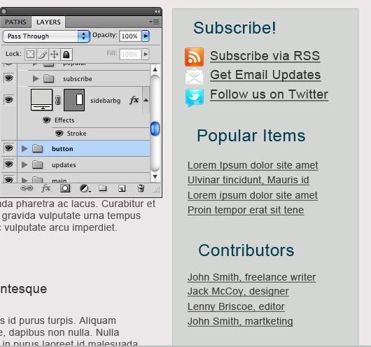
On to the sidebar now. The sidebar has three elements, each of which will be wrapped in its own div. Each div will contain an header, and an unordered list, and each list item will again contain an anchor tag. So go ahead and copy and paste your text in, and it should look something like this:
- <div id="sidebar">
- <div id="subscribe">
- <h3>Subscribe!h3>
- <ul>
- <li><a href="#">Subscribe via RSSa>li>
- <li><a href="#">Get Email Updatesa>li>
- <li><a href="#">Follow us on Twittera>li>
- ul>
- div>
- <div id="popular">
- <h3>Popular Itemsh3>
- <ul>
- <li><a href="#">Lorem ipsum dolor site ameta>li>
- <li><a href="#">Ulvinar tincidunt, Mauris ida>li>
- <li><a href="#">Lorem ipsum dolor site ameta>li>
- <li><a href="#">Proin tempor erat sit tenea>li>
- ul>
- div>
- <div id="contributors">
- <h3>Contributorsh3>
- <ul>
- <li><a href="#">John Smith, freelance writera>li>
- <li><a href="#">Jack McCoy, designera>li>
- <li><a href="#">Lenny Briscoe, editora>li>
- <li><a href="#">John Smith, martketinga>li>
- ul>
- <a href="#">Join Our Teama>
- div>
- div>
Footer
We may as well put the footer in before checking it in the browser, it should only take a second. Worth noting is that any symbols you want to use in your text have special codes in html, for example, the copyright symbol is coded as ©- <div id="footer">
- <div class="container">
- <p>Copyright © 2009 MySite <br />
- All Rights Reservedp>
- div>
- div>
Part Four - CSS
Step 20 - Adding CSS
Now, this is where the magic happens. Create a new file in our site folder, and call it "style.css". Now we need a way to tell the browser that this css file belongs to our index.html file, so we link to it with the "link href" tag. Put this line of code into your section, beneath the title.Step 21 - Basic Cleanup
There are a couple ugly things about our site that we can fix right away: we want to change the default font, we want the content to be 800px wide and centered, and we want to get rid of all those spaces between the elements.First, we're going to pick a font for all text within the body of the page, which will be displayed unless otherwise specified:
- body { font-family: Arial, Helvetica, sans-serif; }
- .container {
- width: 800px;
- margin: 0 auto;
- }
CSS reset
All browsers use default padding and margin values for each element, which makes unstyled pages look nice, but for us they just get in the way of our own styles.To get rid of all these messy margins, we're going to use a very simple css reset, which is just a rule that gets rid of the default padding and margins on the elements we're using. Put this at the top of your css file:
- '
- body, div, h1, h2, h3, h4, h5, h6, p, ul, img {margin:0px; padding:0px; }
Step 22 - Header
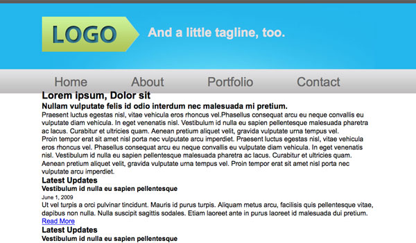
Okay, so everything's all squished up and ready for us to manipulate! Now we get to start adding our own styles, again, from top to bottom. Let's get the tricky part out of the way first: setting the background images for the header.We'll star with the repeating slice we took of the header. The repeating image is going to be within the "main" div, which has an undefined width. We need to let the browser know where the image is, and what to do with it (repeat, no-repeat) to set a background image, we use the property "background" and specify the location of the image or 'url': in our case, the image is in our images folder, so we specify the location like this:
- url (images/header_slice.jpg)
- #main {
- background: url(images/header_slice.jpg) repeat-x;
- }
- #main .container {
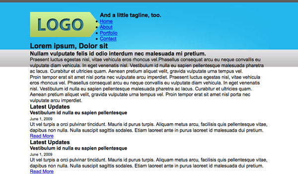
- background: url(images/header.jpg) no-repeat;
- }
Step 23 - Logo Image Replacement
Our logo is pretty complicated, right? we're using an image background, and a non-html font with an inner shadow. We can't do that in css, so we have to replace the text with an image. "why not just put the image in place of theline?" you may ask. Well, on the internet, the
header is basically the 'name' of your page, and important, powerful robots (google) scan for this property when searching for keywords. If you don't have an
header, your site could be called kalamazoo, but it wouldn't turn up in a search for that exact word. There are various other techniques which have their advantages over this one, (see here, especially technique #8) but this is the simplest and the most appropriate technique for this situation. So, to fix this problem, we use a devious little technique called "image replacement" to use the image that we want, while keeping the
header in our markup. First, let's add the image as a background to the #logo div.
- #logo {
- background: url(images/logo.png) no-repeat;
- }
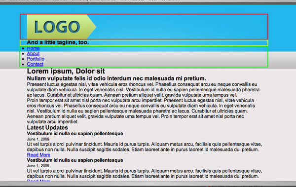
if you look at your browser, you'll see that our logo has been chopped in half. This is because we haven't given it any room, we can solve this by specifying the dimensions of the image:
- #logo {
- background: url(images/logo.png) no-repeat;
- height: 84px;
- width: 235px;
- }
Better, but we still have the original
- #logo {
- background: url(images/logo.png) no-repeat;
- }
- #logo {
- background: url(images/logo.png) no-repeat;
- height: 84px;
- width: 235px;
- }
text in our way, but we can fix it! All we're going to do is set the text-indent value to something ridiculous, like -9999px, way off the page, so no one will ever see it, except the search engine robots.
- #logo h1 {
- text-indent: -9999px;
- }
now take a look, and our logo image is happily sitting where our
- #logo h1 {
- text-indent: -9999px;
- }
text used to be. But it still looks pretty bad, all cramped up at the top there. When we want to move an item from its original position on the page, we can use both the padding and the margin properties. We're going to try both to see the difference First, let's try adding a margin to the top of the h1 tag. We can find out how big to make it with the ruler tool in Photoshop.
- #logo h1 {
- text-indent: -9999px;
- margin-top: 40px;
- }
Oops! We managed to move the logo, but it took the whole page with it! Let's try adjusting the padding instead:
- #logo h1 {
- text-indent: -9999px;
- padding-top: 40px;
- }
Now take a look, and the damn thing went back to where it started! This is because the margin property moves the whole element, but the padding only moves the content of the element, leaving the background where it is. So, if our screen was, say , 19999px wide, we would see our outcast
- #logo h1 {
- text-indent: -9999px;
- margin-top: 40px;
- }
- #logo h1 {
- text-indent: -9999px;
- padding-top: 40px;
- }
header move down 40px, but this is not what we were going for. So, to move the background image of the logo, we need to move the div above it, because the whole logo div is the "content" of the header div. let's try it out:
- #logo h1 {
- text-indent: -9999px;
- }
-
- #header {
- padding-top: 40px;
- }
Much better! Now our logo looks just like it does in our psd, in exactly the right spot. If only we could fix that tagline...
- #logo h1 {
- text-indent: -9999px;
- }
- #header {
- padding-top: 40px;
- }
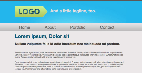
Step 24 - Floating the Tagline
So now we need to find a way to get that tagline out beside the logo. Problem is, html elements naturally stack vertically, pushing eachother up and down the page. We have a few options to fix this, but I'm going to use floats, which are a little tricky, but seriously useful once you get the hang of them.Okay, so what's a float? Well, that's complicated. Basically, when you tell an element to 'float', it sticks it to the side of a page or element, and also takes it out of the normal "flow" of the page. Confused? Let me demonstrate.
- #logo {
- background: url(images/logo.png) no-repeat;
- height: 84px;
- width: 235px;
- float: left;
- }
- #tagline {
- float: left;
- }
- <div id="header">
- <div id="logo">
- <h1>Logoh1>
- div>
- <div id="tagline">
- <h3>And a little tagline, too.h3>
- div>
- <div style="clear:both">div>
- #tagline h3 {font-size: 30px; color: #e4dfdf; }
- #tagline {
- float: left;
- padding-top: 20px;
- padding-left: 20px;
- }
Step 25 - Navigation Bar
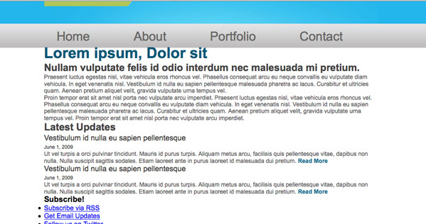
now we need to get our navigation menu in a straight line. First things first, though, we're going to style the font so we can space things out accordingly. When you style the font of a list of anchor tags, you need to specify not only that you are referring to list items, but to the anchors within them. We're specifying our specific unordered list, so that we can deal with the other ones separately. We also need to get rid of the underlines and the bullet points.- ul#menu {
- list-style: none;
- }
- ul#menu li a {
- font-size: 30px;
- color: #676666;
- text-decoration: none;
- }
- ul#menu li {
- float: left;
- }
- <ul id="menu">
- <li><a href="#">Homea>li>
- <li><a href="#">Abouta>li>
- <li><a href="#">Portfolioa>li>
- <li><a href="#">Contacta>li>
- ul>
- <div style="clear:both">div>
- div>
- ul#menu {
- list-style: none;
- padding-top: 55px;
- }
- ul#menu li {
- float: left;
- padding-left: 30px;
- }
- ul#menu li {
- float: left;
- padding-left: 30px;
- padding-right: 75px;
- }
Step 26 - Content
Top area
The first thing we're going to do here is set all the fonts, so we can see the spacing we have to work with. just plug in the font info from Photoshop:- #content h2 {
- font-size: 36px;
- color: #015878;
- }
- #content h3 {
- font-size: 24px;
- color: #444444;
- }
- #content h4 {
- font-size: 18px;
- color: #373737;
- font-weight: normal;
- }
- #content p {
- font-size: 14px;
- color: #595858;
- }
- #content small {
- font-size: 12px;
- color: #373737;
- }
- #content a {
- color: #0f6c8d;
- font-weight: bold;
- text-decoration: none;
- }
- body {
- font-family: Arial, Helvetica, sans-serif;
- background: #ebe8e8;
- }
- #content h2 {
- font-size: 36px;
- color: #015878;
- padding-top: 25px;
- }
- #content h3 {
- font-size: 24px;
- color: #444444;
- padding-top: 20px;
- }
- #content h3 {
- font-size: 24px;
- color: #444444;
- padding-top: 20px;
- padding-bottom: 20px;
- }
- #content p {
- font-size: 14px;
- color: #595858;
- padding-top: 20px;
- }
News section
The spacing is a little different in the news section, first of all, we need to push it down the page a bit. There's also too much padding beneath the h3 heading, so we're going to remove a bit. We also need to reduce the padding above the paragraphs, and add some padding between the two news items.- #news {
- padding-top: 10px;
- }
- #news h3 {
- padding-bottom: 10px;
- }
- #news p {
- padding-top: 10px;
- padding-bottom: 14px;
- }
Step 27 - Floating the Sidebar
first, we need to set the width for the content section:- #content {
- width: 510px;
- }
- #content {
- width: 510px;
- float: left;
- }
- #sidebar {
- float: left;
- }
- <div id="contributors">
- <h3>Contributorsh3>
- <ul>
- <li><a href="#">John Smith, freelance writera>li>
- <li><a href="#">Jack McCoy, designera>li>
- <li><a href="#">Lenny Briscoe, editora>li>
- <li><a href="#">John Smith, martketinga>li>
- ul>
- <a href="#">Join Our Teama>
- div>
- div>
- <div style="clear:both">div>
- div>
- div>
- #sidebar h3 {
- font-size: 24px;
- color: #044055;
- font-weight: normal;
- }
- #sidebar ul li a {
- font-size: 14px;
- color: #393838;
- }
- <ul id="subscribe">
- <li><a href="#">Subscribe via RSSa>li>
- <li><a href="#">Get Email Updatesa>li>
- <li><a href="#">Follow us on Twittera>li>
- ul>
- ul#subscribe li a {
- font-size: 18px;
- }
- #sidebar ul {
- list-style: none;
- }
- #sidebar {
- float: left;
- margin-left: 55px;
- margin-top: 35px;
- }
- background: #d4d6d3;
- border: 1px solid #BEBDBD;
- padding: 15px;
- #sidebar h3 {
- font-size: 24px;
- color: #044055;
- font-weight: normal;
- padding-bottom: 20px;
- padding-left: 15px;
- }
- #sidebar ul {
- list-style: none;
- padding-bottom: 25px;
- }
- #sidebar ul li a {
- font-size: 14px;
- color: #393838;
- }
- ul#subscribe li {
- padding-bottom: 5px;
- }
- ul#subscribe li a {
- font-size: 18px;
- }
Okay, so let's get those icons working. Adding images to an unordered list can seem confusing, but if you take things step by step, it makes perfect sense. But it is a bit tedious. To start, we're going to have to make some room for the icons. We're going to set them as background images, so if we use the padding property to move our list items over a bit, the images won't be affected. The icons are about 26px wide, so we'll add some padding to the left of the list items:
- ul#subscribe li {
- padding-bottom: 5px;
- padding-left: 30px;
- }
- <ul id="subscribe">
- <li id="rss"><a href="#">Subscribe via RSSa>li>
- <li id="email"><a href="#">Get Email Updatesa>li>
- <li id="twitter"><a href="#">Follow us on Twittera>li>
- ul>
- li#rss {
- background: url(images/rss_icon.png) no-repeat;
- }
- li#email {
- background: url(images/email_icon.png) no-repeat;
- }
- li#twitter {
- background: url(images/twitter_icon.png) no-repeat;
- }
- ul#subscribe li {
- padding-bottom: 5px;
- padding-left: 35px;
- }
We need to target the button, so let's add a class to the markup: (im using a class instead of an id this time, which is common practice, as we could hypothetically add more buttons later)
- a.button {
- color: #393838;
- text-decoration: none;
- background: url(images/button_slice.jpg) repeat-x;
- }
- margin-left: 30px;
- padding: 13px 23px;
- margin-left: 14px;
- #sidebar {
- float: left;
- margin-left: 55px;
- margin-top: 35px;
- background: #d4d6d3;
- border: 1px solid #BEBDBD;
- padding: 15px 15px 30px 15px;
- }
finally, we just need to add that 1px border to the button class:
- border: 1px solid #c7c7c7;
Step 28 - The Footer
Last but not least, our simple little footer. We'll set the footer the same way as we set the header: Using a repeating slice within an div of unspecified width, and then adding the content inside a fixed-width, centred div. This is where our .container div comes in handy, because we don't need to specify the 800px or margin:auto this time, because it's already done. Let's start with the repeating slice:Step 29 - Little Changes
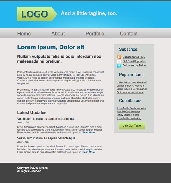
In a browser, stuff looks a bit different than in Photoshop, so we might want to make some minor changes. For example, I'd like a bit more padding above the main content and sidebar. We'll add it to the bottom of the menu.I also decided that I wanted the menu to align to the left, so I'm going to remove the padding-left. Now the items are closer together, because we had padding of 75px on the right and 30px on the left, for a total of 105. Now that we've taken away the left padding, we need to add it to the right to make up the difference:
And the grand finale:
Now just some housekeeping to worry about: Validation.
Step 30 - Validation
Now validation is a crucial step in website design, I'm not going to go into the endless reasons here because this article does it for me. Here I'm just going to walk through the process:HTML Validation
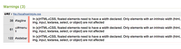
Go to the w3.org Validation Service, select validate by file upload, and select your index.html file, and click "check." Next... The moment of truth:RED (Red is bad!)
Don't worry, it's not so bad; let's review what went wrong: looks like I only have one error:
Success! Our page is now valid XHTML. You can even download an icon if you want to brag.
Note: I was pleasantly surprised to find only one error, if you're not so lucky, read the suggested info at w3 shcools, or check out this article by Glen Stansberry.
It seems we're done! Ah, but if only it were that easy. We still have to validate our CSS!
CSS Validation
Head over to The w3 CSS Validator and go through the same process as with the html, only this time select your style.css file. Checking...We're Valid!
However, we did get a couple warnings. To stay within the good graces of the church, we should certainly pay attention to them:
And reload: no change, excellent. Next, the menu list items. this is a little trickier: Our page is 800px wide, so that's the maximum total width of all the list items together. If we divide by the four list items, and set the width to 200px, the items get mixed up and list vertically. This is because we have padding on either side of each list items: 30px on the left and 75px on the right. Subtract that 105 from 200, and the remaining width is 95px.
Same idea with the sidebar: let's first take a look at the width of the content area: 510px. The remainder in our 800px page is 290px, but first we need to subtract all the padding on the left and right: 290-30=260. Next subtract the left margin, and we're left with 205px. One last problem: our 1px border, so let's subtract another 2px, and set the width of the sidebar to 203px. Check it again, no change.
Excellent, if we validate again, no errors, not even a warning! Our webpage, as far as w3c standards are concerned, is perfect.
Subscribe to:
Posts (Atom)